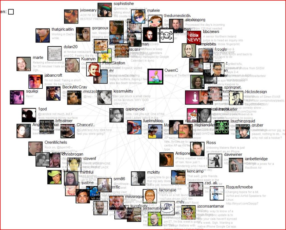
 I came across a great post today that talk about 17 ways to visualise your (and other people’s) network in Twitter. People’s connections are public (who they follow and who’s following them), so there’s a wealth of data that can be used in a pretty interesting fashion. If you click on the thumbnail in this post, you’ll see part of my network, together with some of the people in their network.
Here are some thumbnails of things you can see:


There are a whole host of other ways you can see what’s going on and it’s nice to see analytics being used for something more pretty than visualising fluctuations in life insurance quotes. There are a couple of great mapping ones too, including one that shows a globe view of the world, spinning around to show where new tweets are comming from. Check it out here.
Oh, and if you’re on Twitter, you can follow me here